These days we are working away to sell our home, buy a home, and somehow produce enough inventory for Twist ;) So of course I decided to throw a wrench into the works by developing an entirely new colour.
My process usually begins one of two ways. Mostly it starts because I take a photo and think ‘this needs to become a colour way!’. Sometimes it starts because I get a colour way in my head though, and then I look through my photos to see what compliments the colour I want to create. This usually feels a little backward to me, but can be its own kind of fun.
I had a colour in my head that was a combo of my ‘Jade’ and ‘Charcoal’ colours. I wanted something muted and cool, not a rich or saturated colour. Something understated, relaxing, serene. I went through a lot of shots looking for the one that would match not only the colours I was looking for, but the mood.
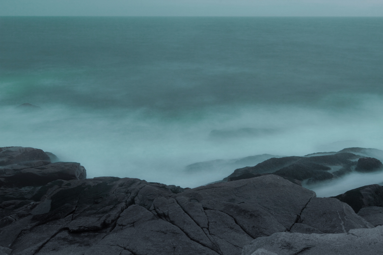
This shot, for example, matches the colours, but the mood isn’t there. It’s industrial, gritty and dramatic.

This shot matches the colours and the mood, but I find the overall composition a little dull, and the beauty of the shot means a lot to me.
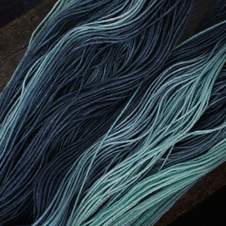
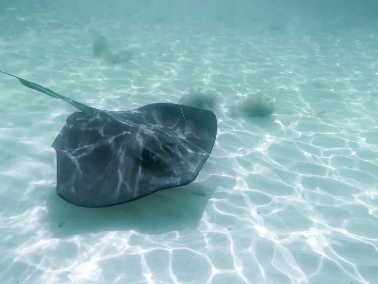
Same here. This photo hits *almost* all the right notes, but I don’t like the seaweed in the background of the shot. This was the top contender though, and we almost ended up with ‘Stingray’.
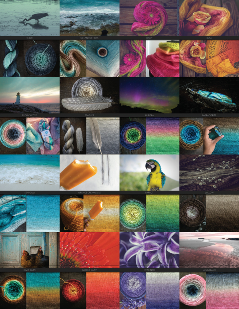
Instead, introducing ‘Heron’ :) Subtle and classy, with neutral, easy-to-wear colours, Heron will be part of our new product offering when the store re opens August 1st.
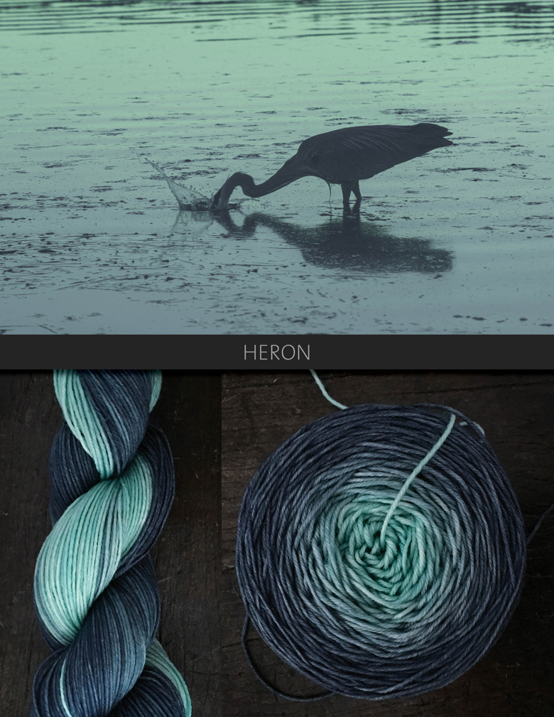
Sometimes I worry that my favourite colour, turquoise, makes too much of an appearance in my collections, but this is different enough that I feel it fits. Rayna thinks I need to add more red though… so that’s the next goal :)