You may have noticed some watercolour’esqu teasers on our instagram – it’s not watercolour, in fact, it’s acid dye! The same dye we use on our yarns.
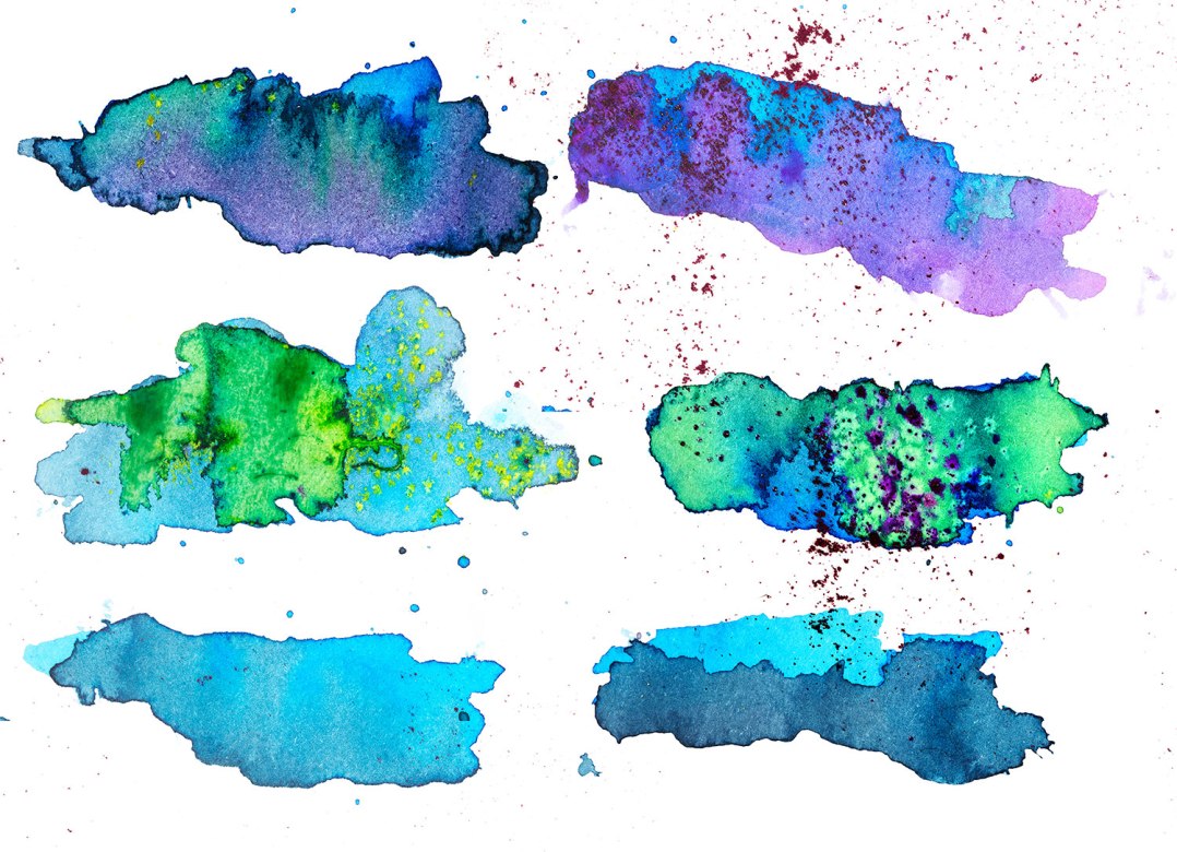
I had quite a bit of fun, painting onto watercolour paper using dyes. Afterwards, I took the “splotches” that I liked most and shot them, then vectorized them (for you marketing types). I then took my favourite of the lot and designed our new logo!
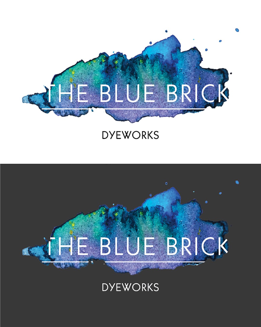
Tada! Look for our new branding starting to make its way slowly onto ball bands and website collateral over the next few weeks. Why a rebrand? There were a few reasons; I wanted something recognizable and original, that hearkened back in a very direct way to what I love doing most; putting colour on things. I also wanted new colours as our signature look, because I wanted to design a signature colourway to go with it, introducing a colour simply called “The Blue Brick”.
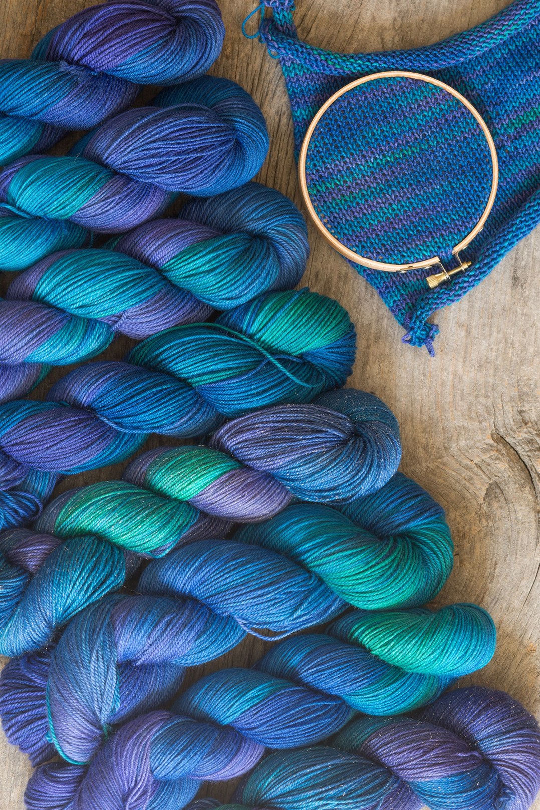
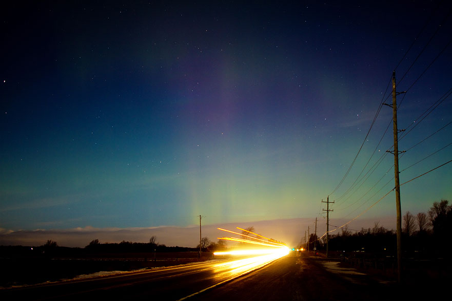
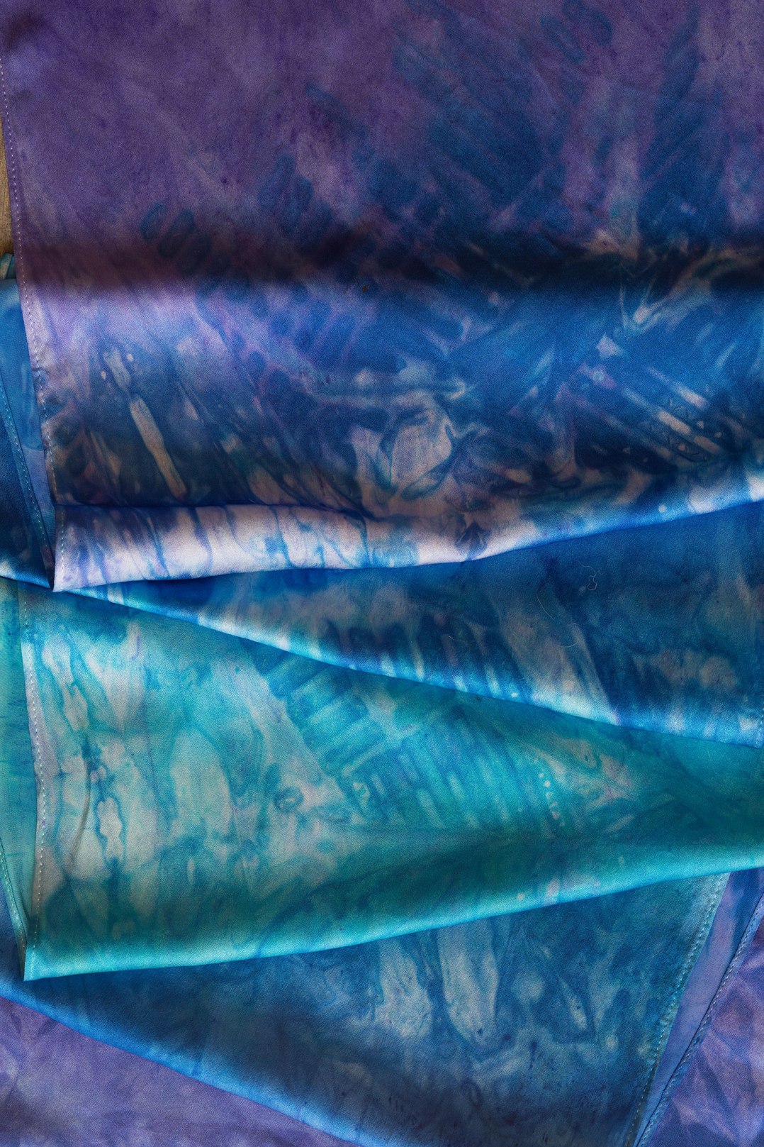
This colour has replaced Iridescent (they’re a little close). It’s a rich tonal that lives in the same space as the new logo; deep sapphire, violet turquoise and just a little hint of green. It also is evocative of one of our favourite hobbies; chasing the Northern Lights, which makes it very us.
Of course it also comes in silk, another reason for “dyeworks” instead of “Inspired yarns”.
That’s my big announcement :) Hopefully you enjoy the new colour as much as I do! We’ll have a giveaway on our instagram feed to promote the new look; follow us there for details!